Beneath the Glass #3: reasons to Draw and hope
This past Sunday my husband and I packed up the kids and ventured to the AGA for the closing day of "Beauty's Awakening: Drawings by the Pre-Raphaelites and their Contemporaries". The exhibit was a visual feast of figure drawings - mainly studies and preliminary drawings in graphite or chalk created in preparation for paintings. These were the type of works that I saw in books (and cheap home-decor prints) as a child, and later would study in university, projected from slides onto the screen of a dark lecture hall.
This Sunday, luckily, our baby didn't mind me pausing his stroller ride to get up-close to a few tonal drawings made with ink and watercolour on paper. (Meanwhile, my husband corralled my daughter through the more colourful exhibit upstairs by Damian and Ron Moppett.) It's been a long time since I had the privilege of studying drawings like this in person and, although it was brief, the experience definitely fed my creative soul.
I classify my ink on glass works as Drawings (with a capital D). The word "Drawing" to me has a very rich meaning. "Drawing" for me is not a first step - it is not just a sketch or a first-draft. When I Draw, I take the traditional media that the PreRaphaelites and those before them used for preliminary drawing (small d), and I create a resolved work that is detailed and dense like a painting. I love the depth that I can achieve in black and white. I love getting my fingers all smudgey as I blend chalks and graphite. And with this particular series, I loved mixing black ink with water on glass and seeing what tones and shapes appeared as it dried. No solvents. No elaborate transfer process. It seems the older I get, the more beauty I find in simplicity.
Simplicity is also a necessity for me right now. My only studio time is when my baby naps and my preschooler is out of the house, which is rare. In order to create enough pieces for Textural Dimensions, I needed to work in a medium that was quick to set up and even quicker to put down. Ink on glass drawings, and paper collage, was perfect. I also must admit that tearing up pieces of old envelopes, book bindings, and paper cutoffs from previous artworks was therapeutic and satisfied my need to get my fingers messy!
On a deeper level, creating something beautiful out of these broken pieces became a metaphor for the work that the Creator is doing in my life and the lives of others I know. No matter how broken, no matter how torn apart, no matter how discarded we may feel - or be - there is always hope, because God is in the business of loving people and making all things new. Even when we lose our fight and healing does not come in this life, God has promised us a new and whole body when we cross over from death to everlasting life.

Creating an image with simple materials.

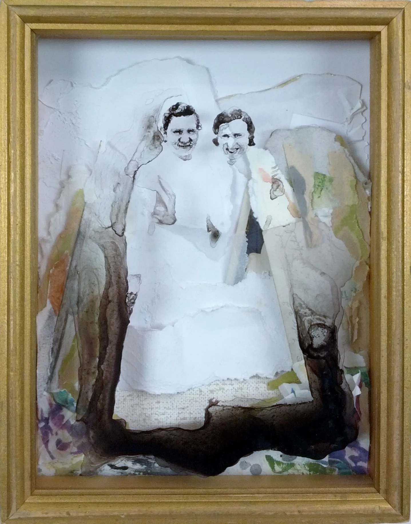
Assembling a collage that works with the image. (The big chunk of green mat board on the right side didn't make it into the final piece, and the clovers worked better in the opposite corner...)
Another collage in progress.
Beneath the Glass #2: Eternally Bloom - children and personal generations
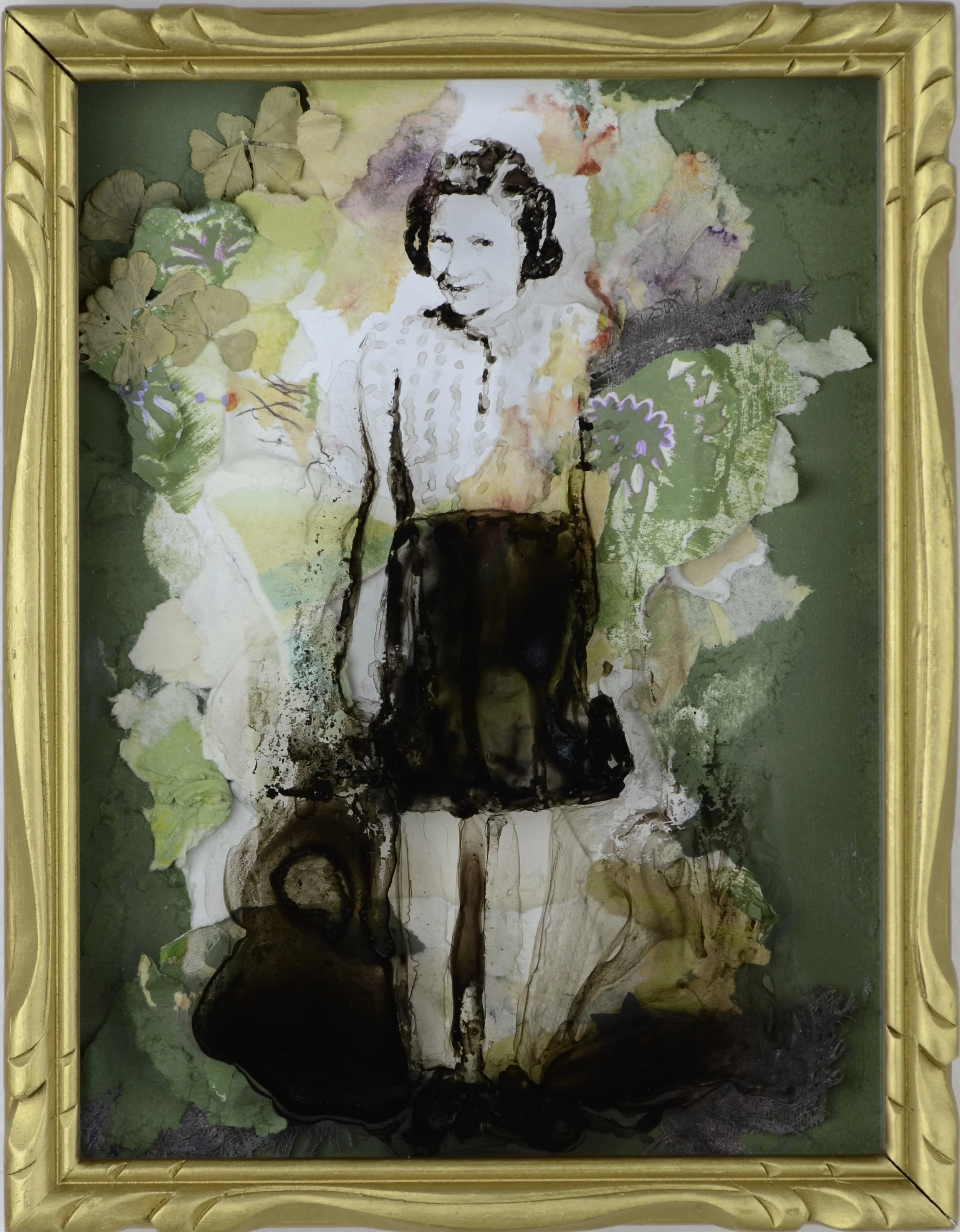
Children make up the majority of the figures in this collection. This is likely because of the stage of life I'm currently in (early motherhood), but also because children grow up and change so quickly, I found them to be ideal subjects for a series about the passing of time.
It was my intention that the vintage styling and muted colours in these works would give viewers a sense that the subjects depicted are no longer children - that the faces they're looking into wouldn't look the same today. I made a point to stick with black ink, mixed here and there with a tinge of brown liquid watercolour, to mimic old photography. I used dried organic materials in several of the collages, especially "Eternally Bloom" and "Come With Me". I felt that incorporating real dried flowers, leaves and bark would not only create a visual feast of texture, but would help further the memento mori theme.

The little girl depicted in "Eternally Bloom" is my late grandmother - my mother's mother who lost her battle with cancer when I was two years old. It is the most personal of all of the pieces in this collection, which is why it borders on nostalgia, although it was never my intention to make these pieces nostalgic. (I didn't want viewers to see the works and think "Aw, the good ol' days... What a beautiful memory... Those sure were good times" as opposed to "Where have these people gone, and what's next for me?") I'm pleased to say that my eldest aunt, who kinda stepped in as the matriarch of our family after my grandmother's passing, has purchased "Eternally Bloom." I'm thrilled it will be staying in our family :)
Just for fun, here's a closer look at a couple personal textures I incorporated into this piece:
- Dried four-leaf clovers. I have a knack for finding four leaf clovers, and have collected them since I was a kid. My son (who would be the newest great-grandchild of my grandmother), was born on St. Patrick's day, so these clovers have taken on another meaning for me. The clovers also help transition the white center into the green edges - I chose green in part because it is my mother's favorite.
- Pressed pansy flower. My grandmother's favorite flower. I just couldn't help but hide a purple one near her feet - you can see it if you look through the ink with a flashlight. I picked this one from my front yard. A small one grows each year in the dirt that we have yet to landscape.
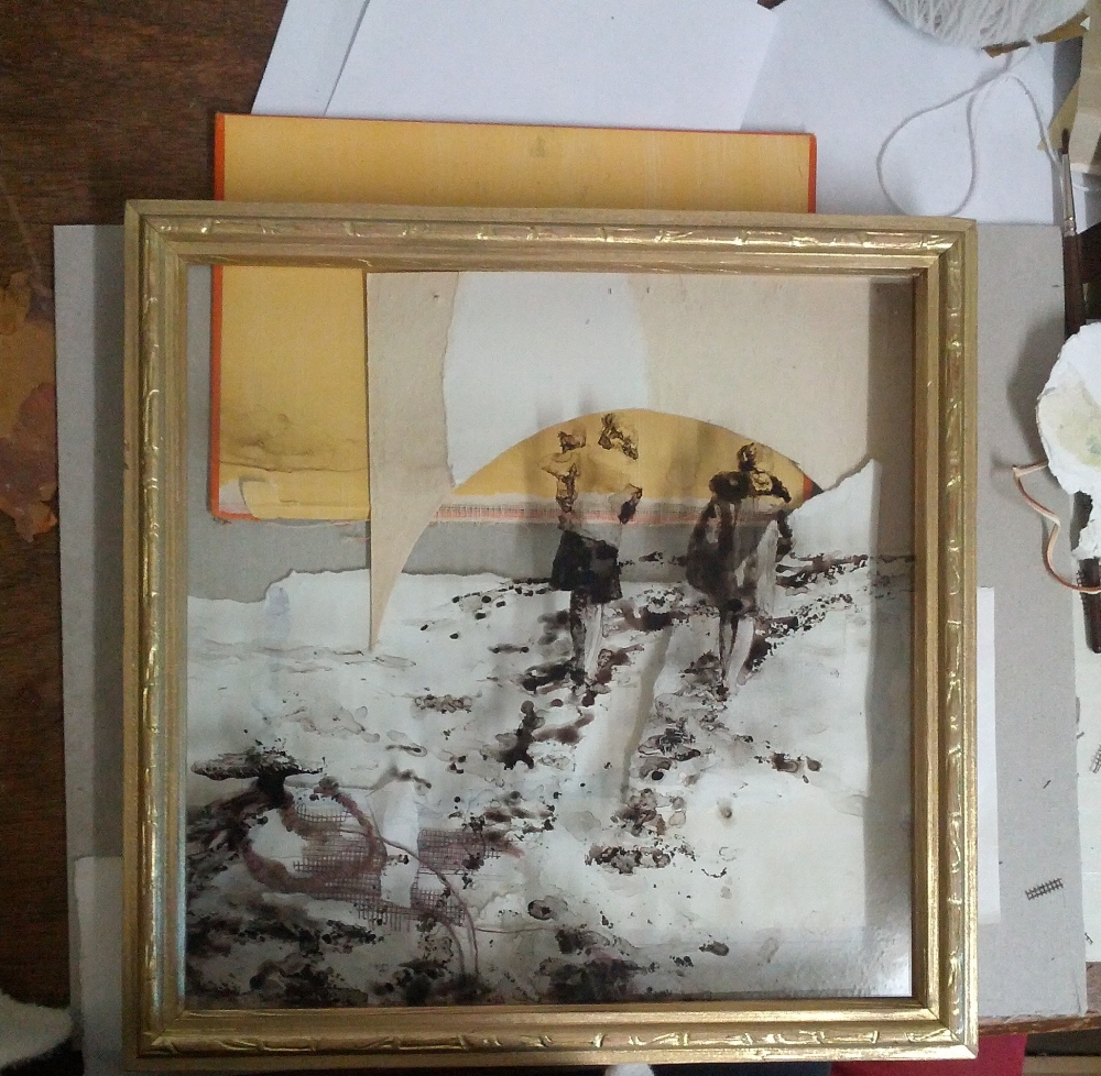
Beneath the Glass #1: Where Our Souls Part

This is one of my first shadowbox + ink creations. This work, like all works in the collection, is intended as a contemporary memento mori (a reminder that death is inevitable). You can see the traditional memento mori at work in old still-life paintings - it usually shows up as a skull, a wilting flower, or a rotting piece of fruit. It's a nudge to viewers that their time on earth is short.
When I was collecting old photographs to use for this series, I came across infant post-mortem photographs from the Victorian era. They were fascinating and disturbing. I quickly decided this subject matter would lead my art down too dark a path, but it did get me thinking about the inevitability of death. I therefore decided to create a series of work that would reference the powerful, unifying force of death but (- and I believe, more importantly -) whisper about what is beyond. The historic Catholic church used traditional memento mori imagery as a call to piety, but my works are intended to speak more about hope and peace once the toils of life are through. But more on this in future posts.
My original title for this work was "Our Souls Part", but it wasn't quite right. I feel that the word "Where" adds a spiritual dimension to the physical dimensions of the work. Where Our Souls Part is the only collage in the show that contains the original reference photo for the image that's painted on it's glass. Well, mostly the back of the photo. The figures are cheery and peaceful, and if you read the inscription on the back of the photo you will discover that they are two healthcare workers enjoying a break on the roof of a hospital. I imagine these women battled and encountered death on a daily basis. I painted the figures in this series in a way that their bodies would fade in and out as they interact with the collaged background when viewed from different angles. The juxtaposition of the fading figures (as well as the title of this work) and the final portion of the inscription always brings a smile to my face. I hope you'll stop by the show and read it for yourself, since I won't be mentioning it here ;)
Beneath the Glass
A dozen of my Shadowbox Inks will be on display at the VASA gallery in St. Albert, AB until November 25. During this time I intend to post explorations and descriptions of several of the works from the show right here in a series called "Beneath the Glass". I hope you enjoy exploring these works as much as I enjoyed creating them.